Case Study
Long-term design partnership since 2021

Overview
Rule is a customer engagement platform helping teams communicate with users across email, SMS, and RCS.
Apollo Studio has partnered with Rule on design since 2021. What began as an early collaboration evolved into a long-term design partnership spanning product UI, design systems, and marketing surfaces as the platform scaled.
This case study is not about a redesign or a launch. It’s about continuity, trust, and how design compounds over time.

The context
When we started working together, Rule was at an early stage. The product needed clarity, structure, and a design foundation that could support growth without constant reinvention.
Rather than approaching the work as a one-off project, we aligned early on a different model: an ongoing design partnership.
This allowed design decisions to be made with long-term impact in mind, not just immediate delivery.
The partnership model
Our work with Rule has been continuous rather than episodic.
Over the years, the scope evolved naturally alongside the product:
Core product UI and UX
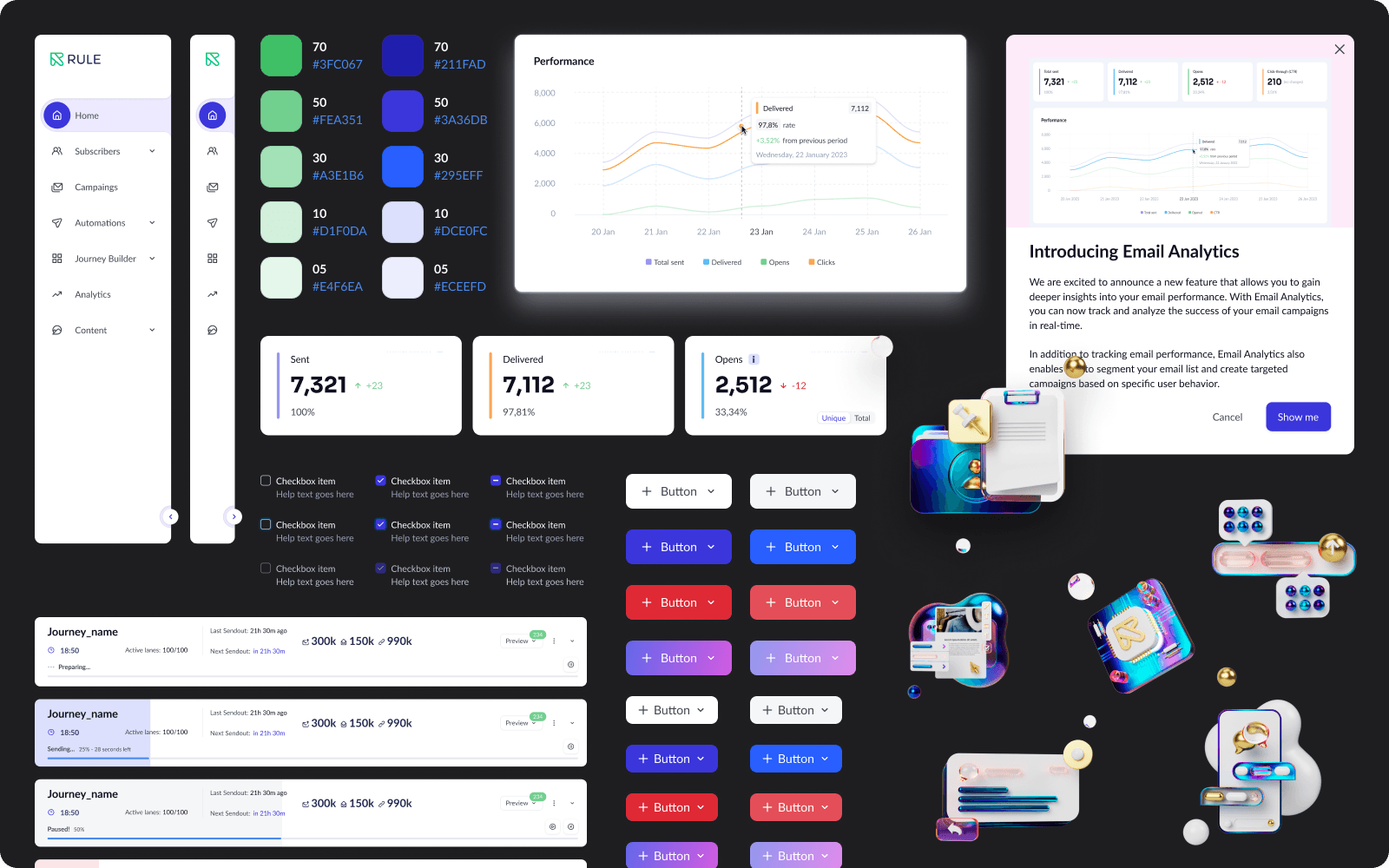
Design system foundations and iteration
New product surfaces and features
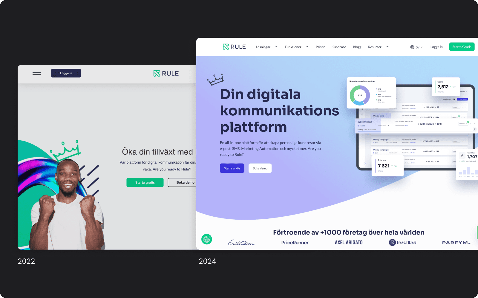
Marketing and growth-related interfaces
Ongoing refinement as the platform matured
Instead of redesigning from scratch every cycle, we built on what already existed, improving consistency, reducing friction, and maintaining momentum.
Design became an extension of the product team, not an external service.

How the work evolved
One of the key advantages of a long-term partnership is context.
With Rule, design decisions didn’t need to be re-explained or re-justified every time. We carried forward product knowledge, user understanding, and system constraints from one phase to the next.
This allowed us to:
Move faster without cutting corners
Maintain visual and functional consistency
Make smaller, more precise design changes with greater impact
Support the team through different stages of growth
Over time, design shifted from “what should this look like?” to “how should this evolve?”

Outcomes
While specific metrics changed over time, the most important outcome was stability.
Rule gained:
A cohesive product experience that could scale
A design system that supported ongoing development
A design partner embedded in the product’s long-term direction
For us, the partnership demonstrated the value of staying with a product beyond launch and treating design as a continuous process rather than a deliverable.
Why this partnership matters
Most design work ends at launch. Products don’t.
Working with Rule since 2021 reinforced a simple belief at Apollo Studio: the strongest design work happens when you stay close to the product as it grows.
This partnership shaped how we work today.
We focus on long-term, founder-led design partnerships, supporting products from 0-to-1 and beyond.
Apollo Studio works closely with our time frames and adjusts delivery and research for each project depending on the needs. For quick solutions they deliver above and beyond and for complex research they always come up with several solutions to discuss.
— Stan Izotov CTO, Rule


